 Back to Al's Text Humor Page
Logo Trivia
|
|
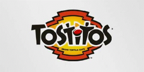
Did you notice the two people enjoying a Tostito chip over a bowl of salsa in the center of this logo? It’s supposed to convey the idea of people connecting with each other.
|
|
|
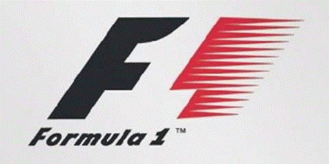
Notice the number 1 in the negative space between the F and the red “speed” stripes. This logo really communicates the feeling of speed.
|
|
|
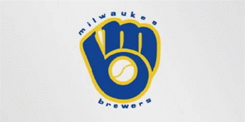
The Milwaukee Brewers professional baseball team’s logo is made up of the letters M above and B below which also form a baseball glove.
|
|
|
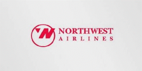
The letters N and W are in the circle but did you see the compass pointing Northwest?
|
|
|
Amazon’s logo gives you some insight into the company’s philosophy. The yellow swoosh looks like a smile because Amazon’s goal is customer satisfaction. But the swoosh also connects the letters A and Z, meaning they sell everything from A to Z.
|
|
|
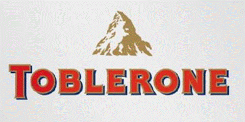
Toblerone is a chocolate company from Bern , Switzerland , “The City of Bears.” They incorporated a Swiss mountain and, if you look closely, the silhouette of a bear.
|
|
|
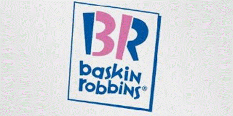
Baskin Robbins’ old logo was the number 31 with an arc above it. This logo takes that idea to the next level by incorporating the 31 in pink parts of the letters, a reference to their 31 flavors.
|
|
|
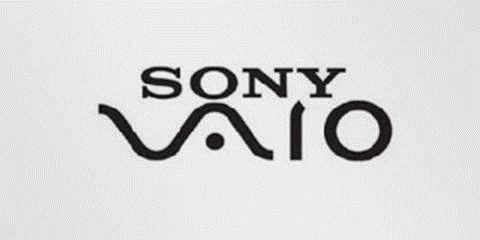
Sony’s logo for their Vaio laptop line uses the first two letters to represent the basic analog signal while the final two letters also look like a 1 and 0, representing a digital signal.
|
|
|
Did you ever notice the arrow in FedEx's logo? Look in the space between the final two letters.
|

From You've Got Laughs! Al Lowe's Book of Internet Humor
coming soon from www.allowe.com
© 1998 - 2010 by Al Lowe • All Rights Reserved • Updated December 24, 2011
